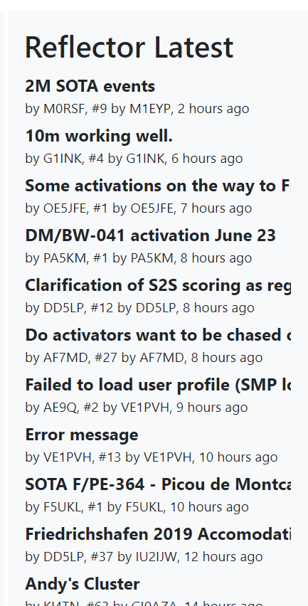
Sorry for the delay on this. I have played about with various colors/shades and have settled on the dark gray with a blue mouseover. It breaks what I might have considered a consistent site link language but the contrast feels much better for the wall of reflector topics.
What do you think?
Before:
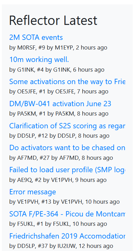
After: