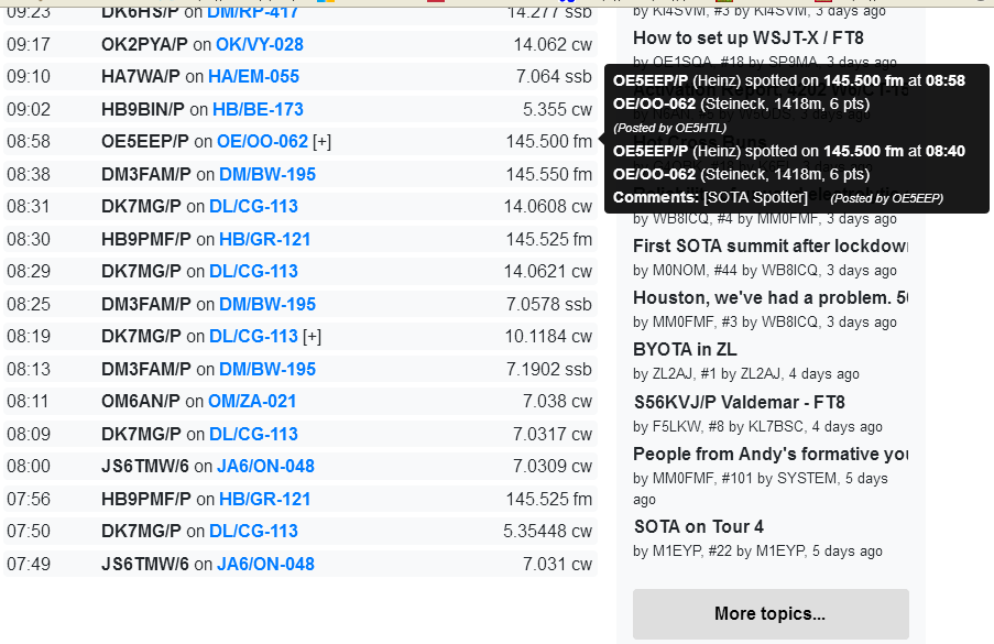
This issue may only be occurring with Fire Fox 75.0 but none the less it is an issue. When the spot at the top of the list shows a + and has more than 2 spots hidden when you mouse over it to see the hidden spots any more that the last 2 are off the top of the page and not viewable. Maybe there is a fix in the settings of Fire Fox for this but I don’t know about it.
It was working and now it is not again. The spot for K7Mk at 2132 had 4 spots in the popup, they all displayed off to the side. Then there was another spot added and it again was displaying at the top of the page with the last 2 showing. I think there should be 5 spots in the popup.
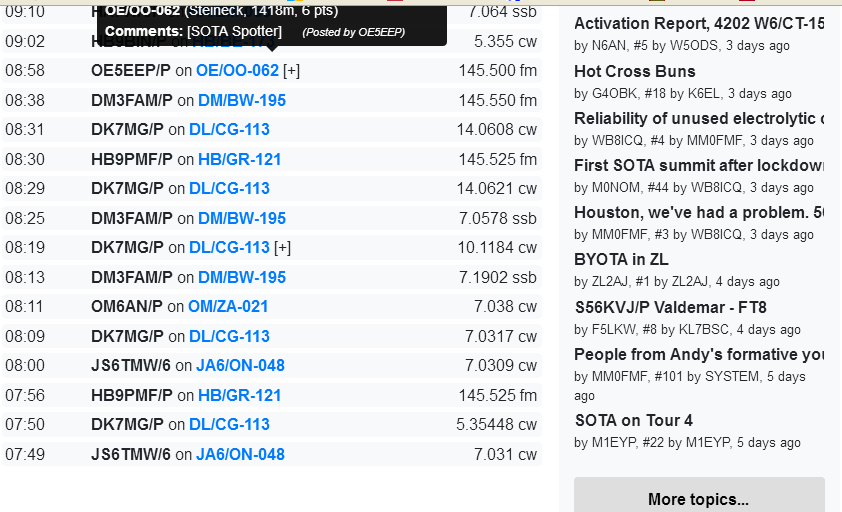
As it moved down the list it again started showing off to the side.
If there is more that 2 spots in the pop up and it displays at the top of the window only the bottom 2 are visible. The top ones are off the top of the browser page. After you said it was fixed it would display the pop up off to the side and lower so they all were visible on the page. Watching the K7MK spot on the 14th when it was the top spot on the list it would display the pop up off to the side, showing up to 4 spots. All was good until there was a 5th spot added then it displayed the pop up back at the top of the spot list and only the bottom 2 spots were visible the others were off the top of the page. I don’t know why it went back to displaying the pop up at the top of the list instead of off to the side like before. I also don’t know what determines where the pop up displays, if it is the web page or the browser. I just know on other web pages in the past popups would display in different places so it would be all in the current window. I am using Fire Fox.
It’s the browser that decides where to put the tooltip based on clues I give it. In this case it is likely that the browser worked out it couldn’t out the tooltip anywhere without it going off the edge, so it went with the first option
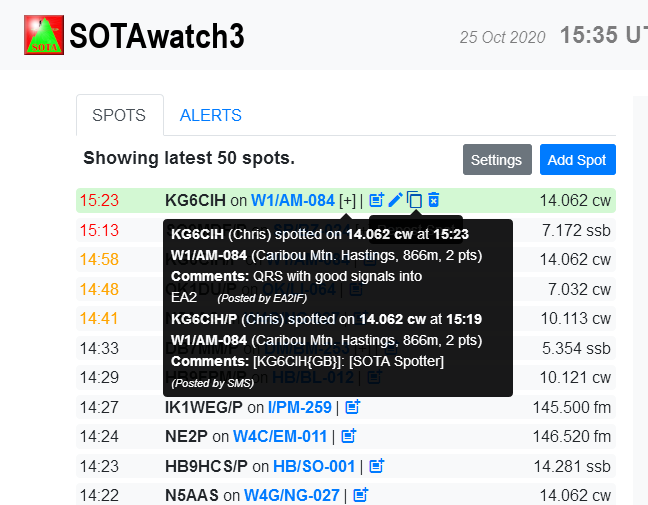
Hi all,
Yes, I’m using Firefox too and I’ve noticed the same effect. The pop up displays in one position or other depending on where the SPOT [+] is placed at that very moment in the screen.
See following sceenshots showing the pop up displayed in different ways depending on the scroll position of the SPOT [+]:
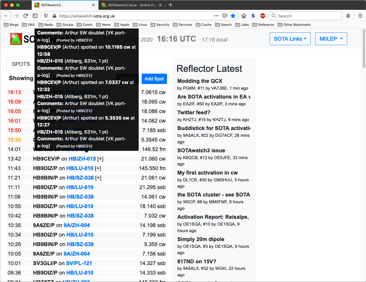
When the SPOT [+] is around the central part of the screen, the pop up window is displayed at the side and it’s fully visible as long as the number of grouped spots is not too big, I guess:
At the side and being the top limit of the pop up window always at the same level of the SPOT [+] row.
That’s the way all the grouped spots will always be visible even when the SPOT [+] is placed at the very top of the screen.
In case it is at the bottom of the screen, we will have to scroll up a bit to place the SPOT [+] towards the center of the screen but that’s something we can always do easily, but we cannot scroll down when the SPOT [+] is at the top of the spots list.
73,
It literally goes through a bunch of options trying to place the tool tip and if they all fail, will go with the first option. I can add some more options in, or I can just tell it to try everything, but if I do that, I’m not fielding complaints about tooltips appearing below the spot
The spot on the first line is still doing this, so I click the [+] to see the expanded spots, and put it back into compact mode when I’m done.
Perhaps “tool-tip below pointer” would be a good starting point then, assuming that folk are usually most interested in the more recent spots? At least that way the spots that’re likely to be off the bottom will be the older ones rather than the more recent? Of course, I’m assuming the more recent spots are usually the ones chasers will be more interested in, but mainly because that’s the way it is for me.
Maybe share your screen resolution and if you have activated an increased font size (or zoom) in your operating system or in the browser.
I did some tests with smaller resolutions (smaller browser windows) and increased font size/zoom. This quickly leads to those problems described.
Just not enough space on the screen to place the tooltip properly.
As an intermediate workaround you can always switch back to the non-collapsed view to show all spots in order.
The important detail is not the screen resolution but the browser window size, and the problem was tripped this time by a rather longer than average set of spots (the top one being 13:42 HB9CEV/P on HB/ZH-015 [+] 21.060 cw.
My browser window is 1230 wide and 950 high at present, give or take. It’s entirely possible I’m not using the default font sizes. Here’s a screenshot of the window (which the reflector may re-scale for display, but which left here as a 1230x950 image) in case it’s any help.
Thanks. It’ll be fine, I expect. It’s not that often someone gets a dozen spots in a row that end up being collapsed in a tool-tip too big for the window, and when there is there’s always the expanded view.
I’m getting some strange occurrences here also. Same computer/same browser, this all
started today. Sometimes no spots, just the header, other times spots OK, have to refresh the page, sometimes that works. But not always.
73,
John, K6YK
@VK3ARR@MM0FMF
You may well be aware of this, but, please, let me say it just in case.
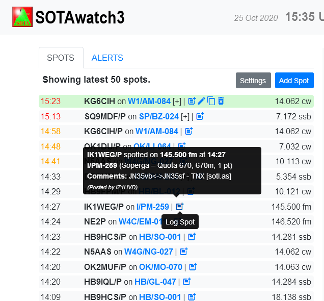
If I hover my mouse on the logging icon, I can see one pop-up black box just underneath informing that such icon is to log the spotted activation, while I see another bigger pop-up black box with the full spot information including the comments.
However, if I hover my mouse on the spot at the top of the screen, both pop-up windows are displayed one on top of the other, and the small ones popping up for each of the icons available can’t be seen because the big one is on top of them.
EDIT: I have just found now that this doesn’t always happen for the spot at the top of the screen, as you can see in the following screenshot, and it looks like it only happens when the big pop-up window has too much information in it and it’s too big to be displayed on top, being, therefore, displayed underneath.