I have switched on a relatively new feature on a trial basis, maybe you have already noticed. I have enabled the side bar which is intended to aid navigation. I believe it is to some extent modifyable by users. Let me know what you think. Should we keep it or not?
Hi
Wondered what was going on with my browser for a bit there!
“should we keep…”
My vote is “no” , but then that is only me ![]()
I prefer reading the content more rather than having many different panes of options which tbh will only be used a small portion of the time.
YMMV
(digs out tin hat from back of cupboard…)
Alan
I like the fact that the sidebar can be folded in and out and is not permanently “fixed”. So everyone can decide whether to use it or not.
What I like is the sidebar on the left when you click on your profile picture.
73 Marcel DM3FAM
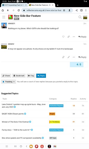
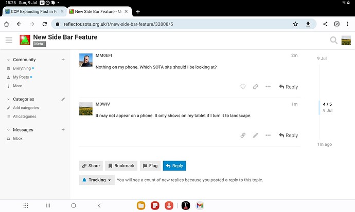
Nothing on my phone. Which SOTA site should I be looking at?
When you are viewing the reflector on your phone, you can touch the burger to the left of your avatar to see the side bar. but you will not be able to see the topics at the same time.
At least that is how it works on my Android phone.
No thanks, it just squashes the messages into a smaller area to the right of the screen.
It makes it much harder to use on your phone when driving.
![]()
![]()
![]()
For me: yes, a keeper !
(since you can hide it if you don’t want it).
Luc ON7DQ
With Chrome on my PC it makes no difference to the width of the messages. And you can hide it so you are no worse off. On my Android phone it doesn’t affect the display at all.
I had also thought I had messed something up in my browser. I’m sort of glad to hear that the change was intentional.
I haven’t looked at how it now appears on my Smartphone but I have to say it’s a “No” vote from me when accessing using Edge browser on Windows 10, as even when the sidebar is turned off it seems that a quarter of the screen on the left and the right is now blank. exactly the areas other websites use to pack adverts into (e.g. SpaceWeatherLive.com).
If there’s a way to turn off the sidebar and then expand the width back to full width (which maybe I haven’t found), then I’m fine with it, but as it now seems to be I’d vote No to the change.
73 Ed.
Update: I get the same effect on Firefox as well as Edge.
Update2:
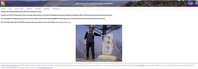
This is what I am seeing - perhaps it’s only on my PC? (John’s tablet looked OK - full width)
In comparison in the same Browser on the same PC, this is how wide (without any blanks) the SOTA database page is:
It’s almost as if the page is formating for a portrait held smartphone screen even though I am using a standard PC (16:9 landscape display)
Having had a chance to try it on a full size screen and not a phone my verdict is: awful, turn it off.
My admin buttons disappear unless I expand the sidebar. I don’t want the sidebar so I can’t have the admin buttons. Unless someone knows better.
Also the notifcations dropdown is new and “broken”. It no longer shows me the order in which people replied or liked posts and seems full of ancient information. I’m assuming that’s related to some other updates.
I’d agree that the ability to hide or display this new side-bar is a plus.
However, when expanded/displayed, it shows me nothing at all that would interest me in the slightest. IMHO, there are already too many bells and whistles in this Discord thing as it is… so, no - not for me.
Cheers, Rob
Causes no end of problems including returning to the list of topics having read to the bottom of one. Used just to click the banner bar to return but now have to click the return arrow - not a deal breaker but teaching an old dog new tricks is not for me.
So, for me, scrap it
Having viewed it on my PC, I’d say that it adds no value to me. Worth a try though ![]()
I agree, no value whatsoever to me either, just more clutter I need to block!
In my opinion it has features that I find useful, but it does not need to be in view all the time so it is best tucked away out of sight until needed. I say keep it. The way to tuck it out of sight took some finding, it wasn’t intuitive for me, but I didn’t grow up with computers!.
When new features are announced, the only way to find out if they are worth having is to try them out live so that is what we have done. The consensus seems to be that we don’t need it and it causes some problems. In particular it makes the some of the reflector managment tasks difficult. Clicking the ![]() does not in fact return it back to the way it was and some reflector controls are not easily managed. Unfortunaely there is not a way to make it optional so I will revert to the previous mode and hope that it does go back.properly.
does not in fact return it back to the way it was and some reflector controls are not easily managed. Unfortunaely there is not a way to make it optional so I will revert to the previous mode and hope that it does go back.properly.
Jim
I absolutely agree with you Jim - if we don’t try new things, we don’t know what we might be missing. Thanks for your efforts and willingness to switch back. Perhaps the next update to discourse may have some other features that the majority will like. We don’t know if we don’t try.
73 Ed.


