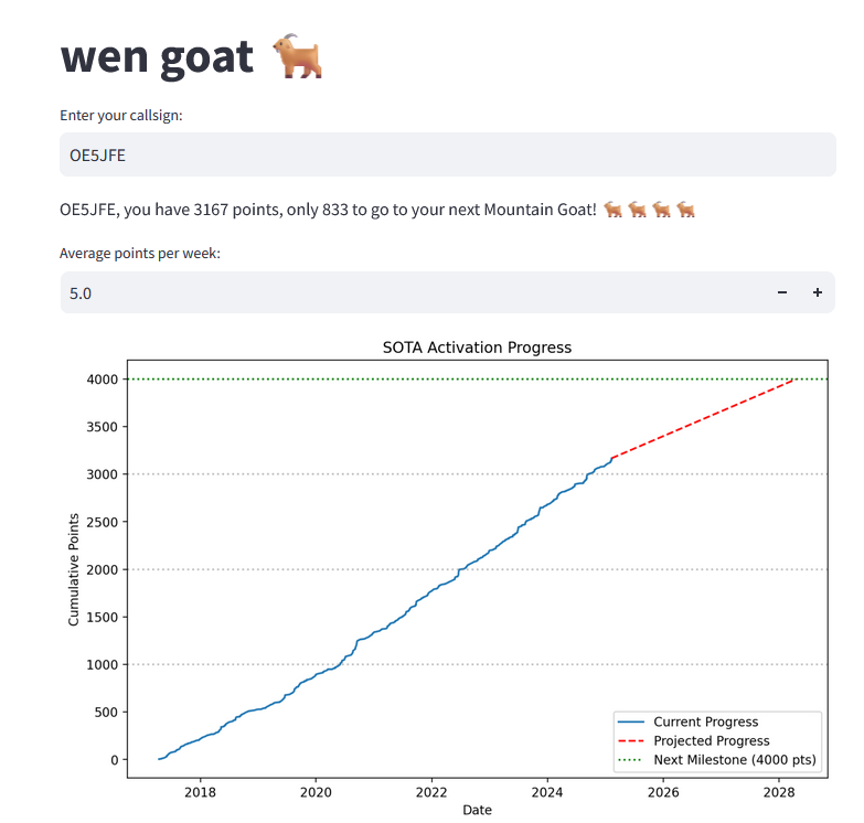
OE5JFE
11 February 2025 22:11
21
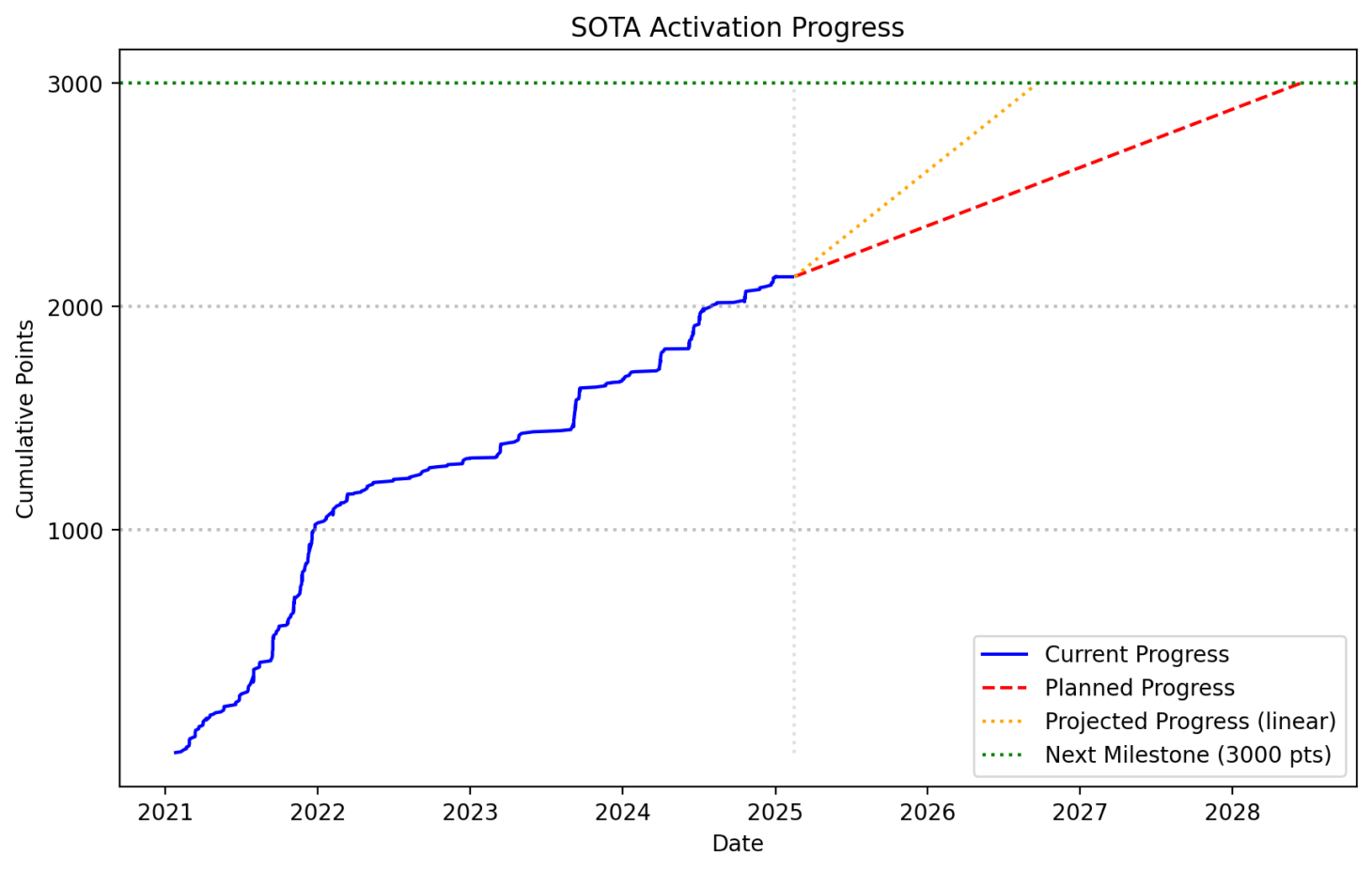
Looking at my data I have the felling the “Average points per week:” are calculated incorrectly?
My curve is almost a perfect line. So the prediction of “Average points per week:” should be higher. Maybe you are not considering the bonus points?
And a horizontal line at every 1000 points would be nice (in dotted grey colour or so)
73 Joe
1 Like
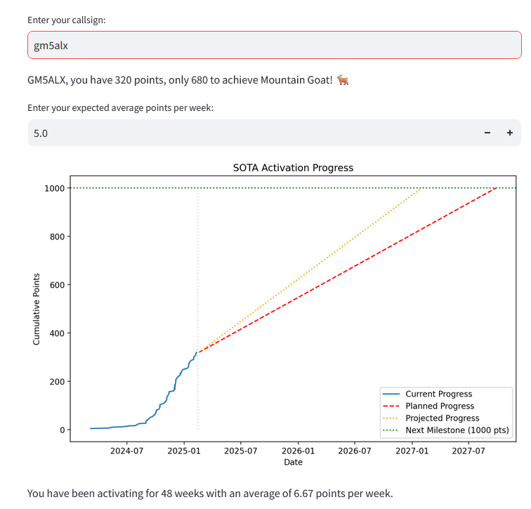
GM5ALX
11 February 2025 22:14
22
This is not calculated, it’s a user input, with a default of 5.0 to start. It relies on you setting what you think is going to be your upcoming average rate. This does make it harder for you but easier for me
Your suggestion on using historical data is still on my todo list, although winter bonuses do add another factor which I’ll probably skip anyway as regions have differences.
Greylines added
2 Likes
OE5JFE
11 February 2025 22:21
23
Okay understood. I thought the whole point was to do that prediction for you.
A linear regression should be faily easy as you have the x,y data alreadyLinear Regression in Python – Real Python
GM5ALX
11 February 2025 22:27
24
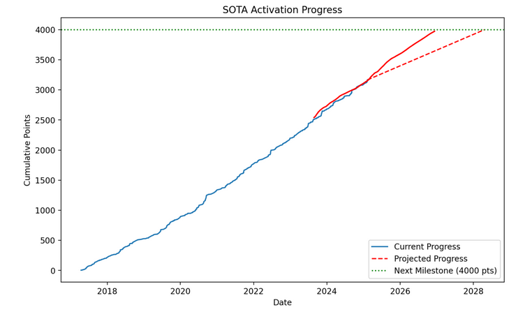
My plan will be to add it as some information for you, e.g. “your past 6/12 months or 25 activations rate has been 6.2 points per week”. Not everyone will continue on their average rate though. Richard’s historical trend is an example of that , and Tim’s has a lot of variation .
Pull requests welcome
1 Like
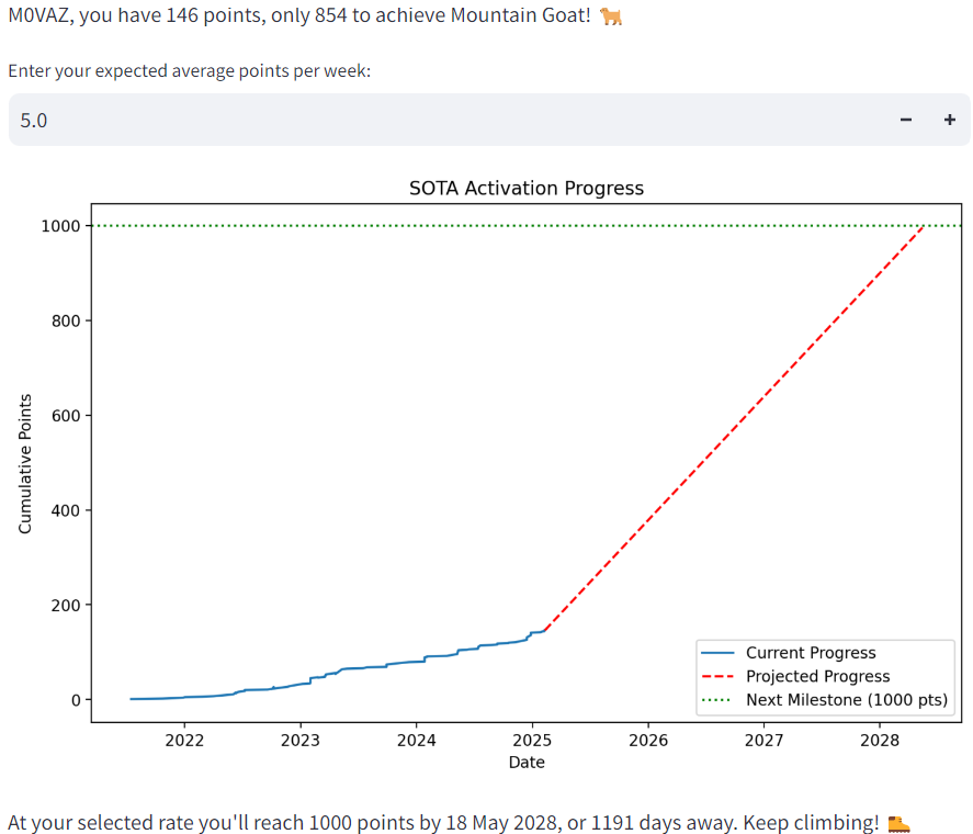
M0VAZ
12 February 2025 10:09
26
A while to go then for me
based on 5 points a week…Yeah thats bit hopeful!
1 Like
GM5ALX
12 February 2025 11:25
27
Thanks to Joe @OE5JFE , the app now shows you your average weekly rate, to inform you for deciding your point forward rate!
HB9DIZ
12 February 2025 20:14
28
Simply wait for stunning results until it has been connected to artificial intelligence … or pair it with my real stupidity, hi.
73, DIZ
1 Like
ZL4NVW
14 February 2025 07:07
29
How come my curve goes the opposite way to everyone elses!
Kinda speaks of sprinting over the finishline then promptly collapsing to be wrapped in one of those shiny blankets!
4 Likes